Some days ago I stumbled upon Tether USDT’s market cap chart and what I discovered left me in shock. I know you’re probably wondering what anyone would be doing on a stablecoin’s chart — well, stick around because things aren’t as boring as they seem.
The chart below graphically represents USDT’s market capitalization, which fluctuates primarily due to changes in its circulating supply (stablecoins are pegged to the US Dollar so their price is usually fixed).
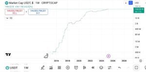
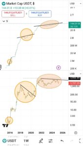
Just one glance at the chart and you can make out the correlation between supply changes in USDT and price cycles in the broader crypto market. But that’s not all — USDT’s chart by itself does not tell the whole story.
Not until you compare it with an actual cryptocurrency.
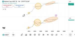
The image you see above is a multi-chart window comparing USDT (top pane) and Bitcoin (bottom pane). As I mentioned earlier, it’s not hard to see the similarity between both charts. However, if you take a close look you’ll notice that, in more than one instance, anytime price (in this case Bitcoin price) makes a higher low and USDT marks a higher high, a strong rally follows.
I first noticed this pattern in the first circle (the image below provides a better view of this pattern) and decided to trace more recent market patterns to see if the pattern repeated itself — well, I wasn’t disappointed.
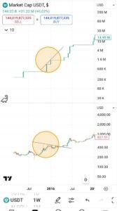
Sometime around December 2017, Bitcoin marked a new high. About a week later, price started falling and by December 2018, Bitcoin had lost more than 80% of its gains from the previous year.
Demand for USDT, on the other hand, slowed through the first 9/10 months of Bitcoin’s crash but didn’t lose any real gains until December that same year when it lost almost 50% of its market capitalization. What happened after is the real kicker here.
You see how Bitcoin struggles to recover from that strong downswing (and eventually fails, crashing for a second time) but USDT marks a new high, even tripling it’s market capitalization from the December 18’ lows?
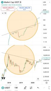
This pattern has repeated itself in the most recent cycle. The key difference this time is that Bitcoin has achieved a higher high, coinciding with an increase in USDT’s market capitalization.
However, when you compare the USDT chart with another cryptocurrency — say Ethereum — the pattern emerges again.
In fact, among the top eight cryptocurrencies by market cap, only Bitcoin and Tron have surpassed their 2021 highs with gains exceeding 15%. In contrast, USDT’s market cap has grown by a staggering 75% when compared to its 2021 high.
So, what relevance does all of this data play in today’s price?
As demonstrated earlier in the article, growth in the market capitalization of a stablecoin (like USDT) is primarily due to increase in the supply of that coin. Since USDT is pegged to the US Dollar, every newly minted USDT represents a corresponding inflow of USD (or equivalent assets) into Tether’s reserves.
Think about it; Why else would someone trade their fiat for a stablecoin if not to invest in a cryptocurrency?
I mean, it makes sense, doesn’t it? As demand for USDT grows the broader cryptocurrency market should also experience increased demand.
But that’s not what we’re seeing in the markets today. So either Tether is minting new USDT for fun or big players are seriously accumulating coins.
Funny enough, the first scenario is actually less likely than the second.
You know I’ve been seeing a lot of posts on social media lately talking about how Accumulator Address (which is a fancy term for addresses that hold over 1000 Bitcoins) operations have been growing at a never-before-seen rate in the past few months.
As someone who doesn’t like to believe anything I can’t personally verify, I decided to do my own research—and let me tell you, the signs of accumulation are very real.
Look, all I’m trying to say is that CryptoQuant’s CEO is bullshitting. The crypto bull run is not over…hell it hasn’t even started.
But who am I anyway? Just some dude struggling to get visitors to his blog 🤷


